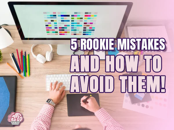
Starting out in graphic design can feel like being handed a box of fireworks without a lighter. You’ve got the creative itch, maybe even a few tools under your belt – but now what? There’s inspiration everywhere, but figuring out what not to do is just as important as learning what works.
This blog is for the beginners, the hobbyists-turned-freelancers, the late-night Canva warriors trying to make things look less “meh” and more “hell yes.” I’m breaking down the 5 most common missteps new designers make – things I’ve seen (and yes, done) countless times. We’re talking about the kind of stuff that doesn’t just make your work look amateur – it slows down your growth, kills your confidence, and keeps you from charging what you’re worth.
Whether you’re building a portfolio, designing your first brand, or just trying to make your side hustle look halfway decent online – this blog is your cheat sheet. If you’ve been second-guessing your eye for design or feeling like your work isn’t “there” yet, don’t stress. You’re not alone – and these are things you can fix.

Design isn’t just about pretty colors and trendy fonts – it’s about communication, clarity, and confidence. But when you’re starting out, it’s easy to fall into traps that make your work feel a little… off. Not because you aren’t talented, but because nobody handed you the manual for “What Not to Do.”
Here’s the thing: design rules aren’t just for snobs. They exist because they work. And the sooner you understand why certain things fall flat, the faster you’ll start making stuff that doesn’t just look good – it works hard and makes people take notice.
This blog isn’t here to gatekeep or preach. I’m walking you through five of the most common design mistakes beginners make, and how to fix them without needing a fancy degree, a MacBook, or a million-dollar Adobe subscription.
Whether you’re self-taught, fresh out of school, or winging it with YouTube tutorials, the mistakes we’re about to cover are the same ones that trip up almost everyone. I’ve coached interns through them, seen seasoned marketers make them, and yes – lived through them myself.
Design has rules, but not because it’s uptight – because it helps you work smarter. These five beginner mistakes? Totally normal. But knowing how to spot (and fix) them? That’s where your growth lives. Once you spot them, you can stop making them. Here are the five most common mistakes – and how to fix them without burning your whole portfolio.
1. Designing Without a Plan
What Happens: You jump straight into any design software and start clicking around. The result? A layout that looks confused and lacks direction.
How to Fix It: Start with a goal. Ask what the design needs to communicate, sketch out a rough structure, choose your fonts and colors with intention, and then hit the software. A little planning goes a long way.
2. Using Too Many Fonts
What Happens: Your design starts looking like a ransom note. It’s hard to read and lacks cohesion.
How to Fix It: Stick to two fonts – one for headings and one for body text. Make sure they contrast but complement each other. And use bold, italic, or caps to add variation within those fonts instead of adding new ones.
3. Ignoring White Space
What Happens: Everything feels squished. Your design looks cluttered, chaotic, and overwhelming.
How to Fix It: Embrace space. Don’t feel like you have to fill every inch. White space gives your content room to breathe and makes everything look more polished and intentional.
4. Overusing Effects
What Happens: Drop shadows! Gradients! Lens flares! Suddenly, your design looks like a bad PowerPoint from 2003.
How to Fix It: Effects should enhance, not distract. Use them sparingly, and always ask: does this help the design – or is it just flashy for no reason?
5. Skipping Feedback
What Happens: You design in a vacuum, and you miss the chance to learn. Or worse – your work isn’t doing what it’s supposed to, and you don’t realize it.
How to Fix It: Show your work to someone – anyone! A fresh pair of eyes can catch things you missed. Learn to love critique. It’s how you grow.
Look, every designer starts somewhere. These five mistakes aren’t a sign that you’re bad at design – they’re just stepping stones you haven’t mastered yet. The key is to notice them, learn from them, and move on with better tools in your belt.
What separates a beginner from a pro isn’t fancy software or expensive gear. It’s intention. It’s pausing before you click “download” on that trendy font and asking: Does this actually help my message land? It’s having the guts to get feedback. It’s learning the power of restraint. And above all – it’s understanding that design is as much about what you leave out as what you put in.
If you’ve seen your work in any of the five mistakes above, take it as a sign you’re right on track. Now you know what to look for, and that means you’re ready to do better. And better is what builds confidence, clients, and cash flow.
So next time you sit down to design, bring some thought to the table. Ask yourself: What’s the goal here? What does the viewer need to know first? Is this design doing its job?
And if you’re still feeling unsure, guess what? You’re allowed to ask for help!
Yep – because they help you skip the messy trial-and-error phase. Think of them like training wheels. You can break them later (and you should!), but in the beginning, they’ll make your work cleaner, faster, and more professional-looking. The rules aren’t there to cramp your creativity – they’re there to give it structure. Once you’ve got that down, you can go full rebel. But learn them first.
If your design looks like it’s yelling from five directions at once, you’re probably using too many fonts. A good rule? Stick to one font for headers and one for body text. Maybe a third if it really adds something. Make sure they actually work together (contrast helps!). Think consistency, not chaos. Fonts are like outfits – they need to match the vibe. You wouldn’t wear a prom dress with Crocs… so maybe don’t mix Comic Sans with Bodoni.
Hey, go wild in your personal projects! But for client work or anything meant to communicate clearly, think minimal. Effects should support your message, not distract from it. If you’re using a glow or shadow just because it “looks cool,” pause. Ask yourself: Does this help? Or is it just there because I was bored? Design is storytelling – effects are the spice, not the whole meal.
Because your brain’s screaming to fill it. That’s normal! But white space isn’t wasted – it’s visual breathing room. It helps guide attention and make your content more readable. It’s also what separates an amateur design from a polished one. Think of white space like a good pause in a conversation – it gives the important stuff a moment to land. So don’t be afraid of it. Embrace the calm.
Start with people you trust – friends, other creatives, even your barista if they’ve got opinions. Don’t just ask “Do you like it?” Ask why. “What feels off?” “What would make this easier to read?” Feedback isn’t about being told you suck – it’s about learning how people experience your work. And every “critique” is a breadcrumb toward better design. Thick skin helps, but so does knowing that your work isn’t you. It’s just a step in your process.

I believe everyone has a unique “Wonderland” inside them – a philosophy inspired by Alice in Wonderland – which I infuse into my work by embracing the weird and unexpected. No matter what I create, I’m always pushing the boundaries of design, exploring new possibilities with every project.