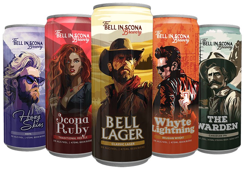
This rebranding project for The Bell in Scona Brewery aimed to distinctly separate the brewery from the event space, ensuring the right audiences visit the right venue. With a focus on B2B sales, particularly targeting restaurants, the new brand identity employs colours and visuals that resonate with a traditional brewery aesthetic, featuring a more male-driven visual identity.
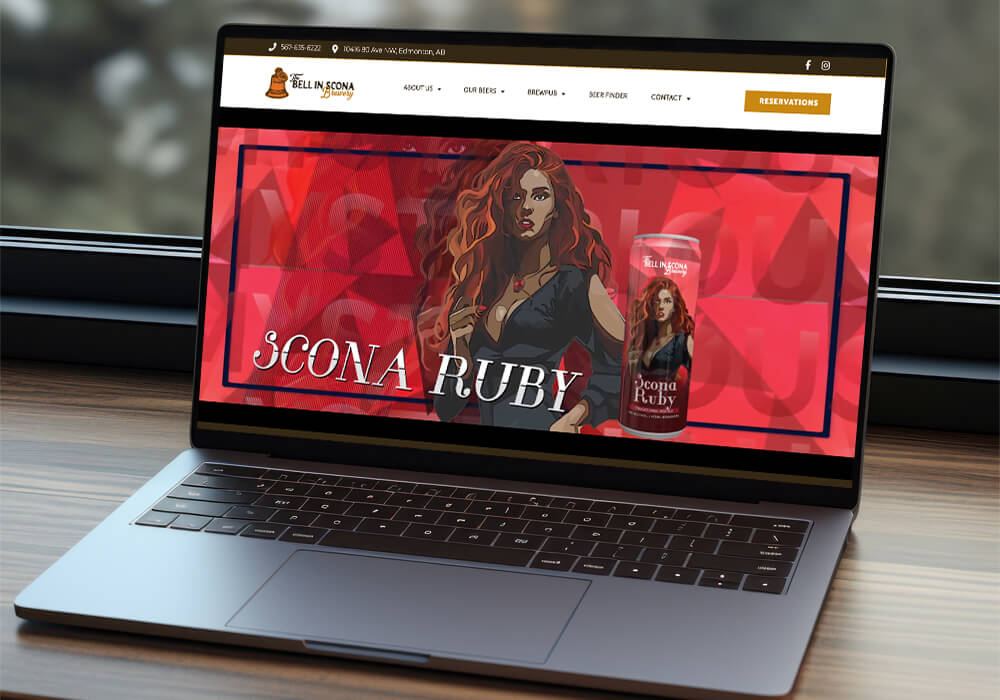
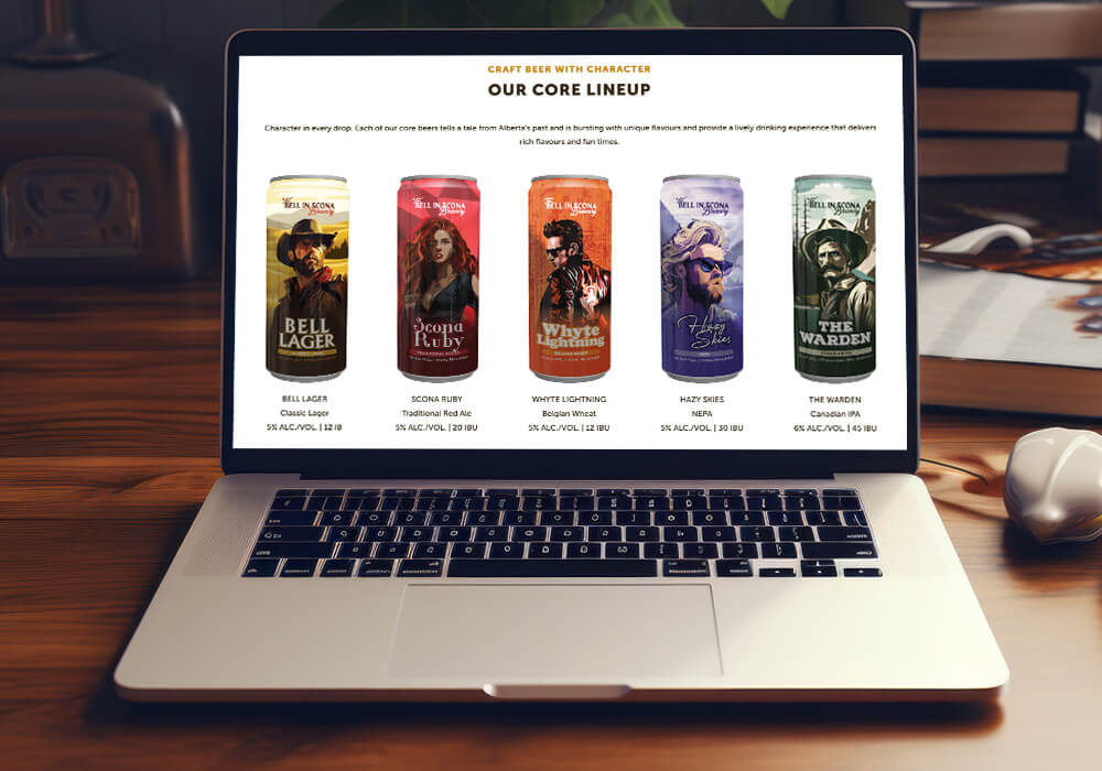
This rebrand also included the creation of a brand-new website, ensuring the refreshed identity was fully realized both online and in-person, reinforcing the brewery’s heritage while making a lasting impression.
Re-Branding
Craft Beer
April 2024
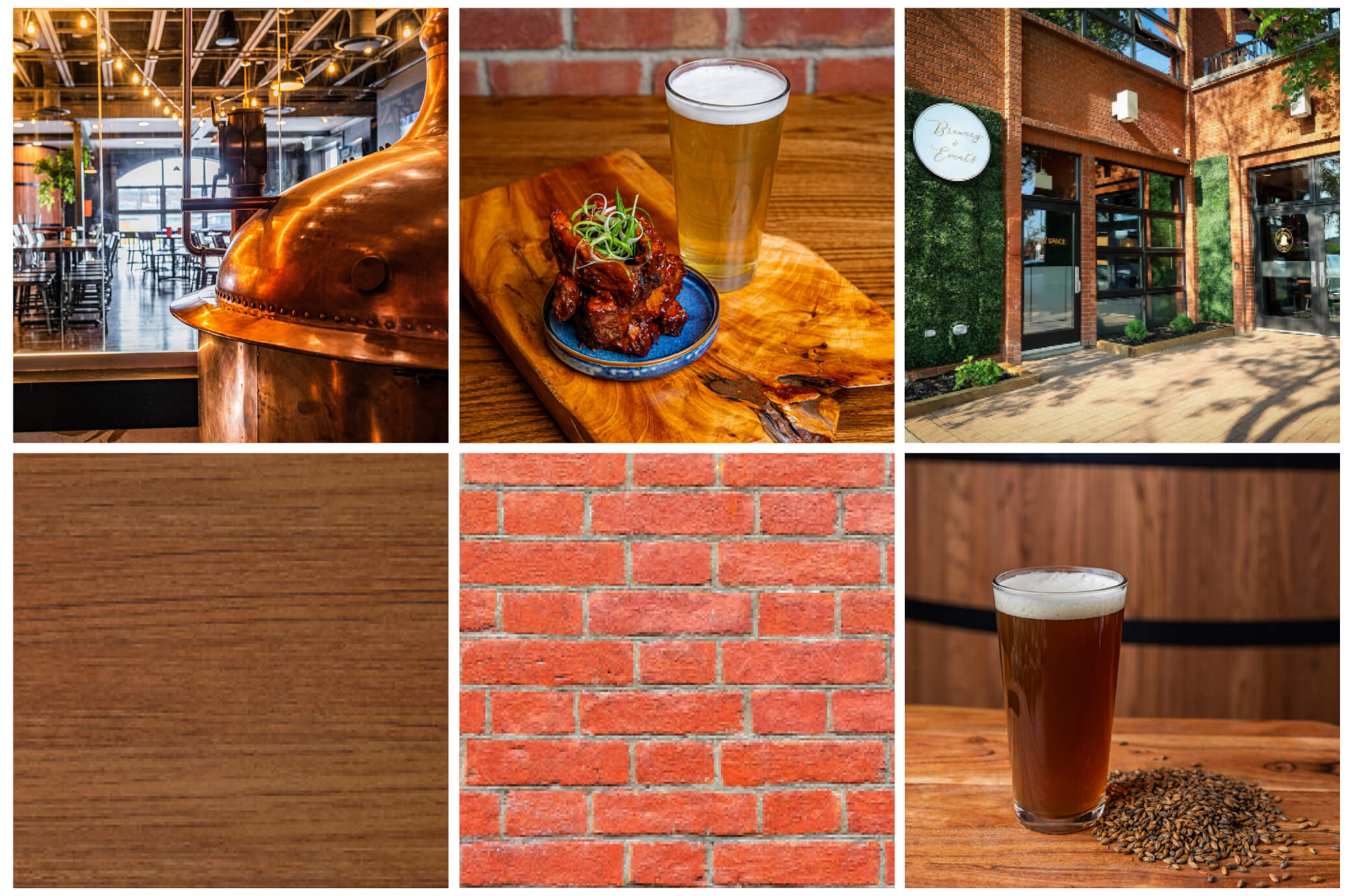
The moodboard I created for The Bell in Scona Brewery rebranding captures the essence of Alberta’s rugged beauty and the craftsmanship of traditional brewing. By combining rich textures, warm earthy tones like copper and brown, and vintage-inspired imagery, the moodboard highlights the brewery’s timeless and rustic character. It serves as a visual guide, ensuring that every brand element, from logos to packaging, aligns with the core identity of the brewery: rustic, traditional, and authentic. This cohesive direction connects the brewery’s heritage with a modern twist, reinforcing its genuine, crafted feel across all touchpoints.
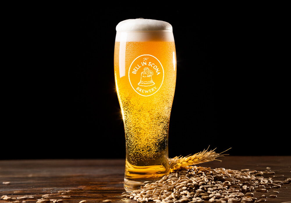
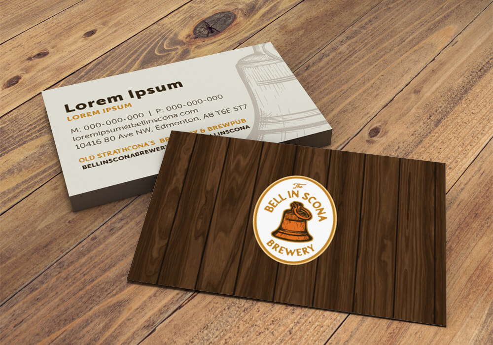
For this rebranding project, the foundation was already laid, making the process quick yet impactful. The Bell in Scona Brewery had an established logo, iconic bell symbol, and fonts, which allowed me to focus on enhancing what already existed. My approach was to refine and elevate the brand’s identity by adding “BREWERY” to the logo, and introducing new color schemes that reflect the brewery’s rustic charm and Alberta pride.
By making these small yet significant changes, I ensured that the rebranding retained its original heritage while making it clearer and more distinct. The result is a seamless blend of tradition and modern brewery aesthetics, strengthening the brand’s visual identity while maintaining its authentic connection to Alberta’s brewing culture.
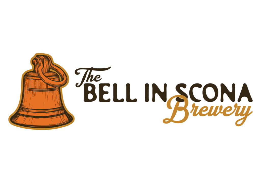
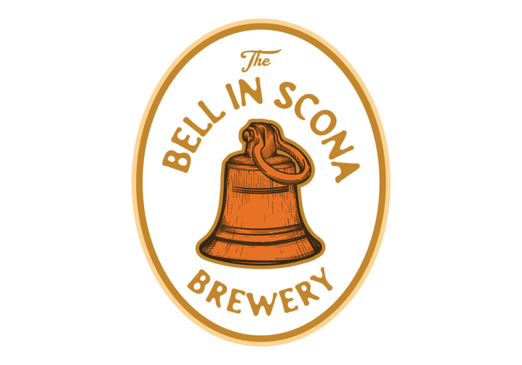
To match the rustic and authentic vibe of The Bell in Scona Brewery, I worked with the existing logo, fonts, and bell icon, enhancing it by adding “BREWERY” and refreshing the color palette. For the fonts, I chose SOERIP, a rugged typeface that perfectly captures the brewery’s bold, handcrafted feel, and Museo Sans 900, which unifies the brewery with its event space for a seamless brand experience.
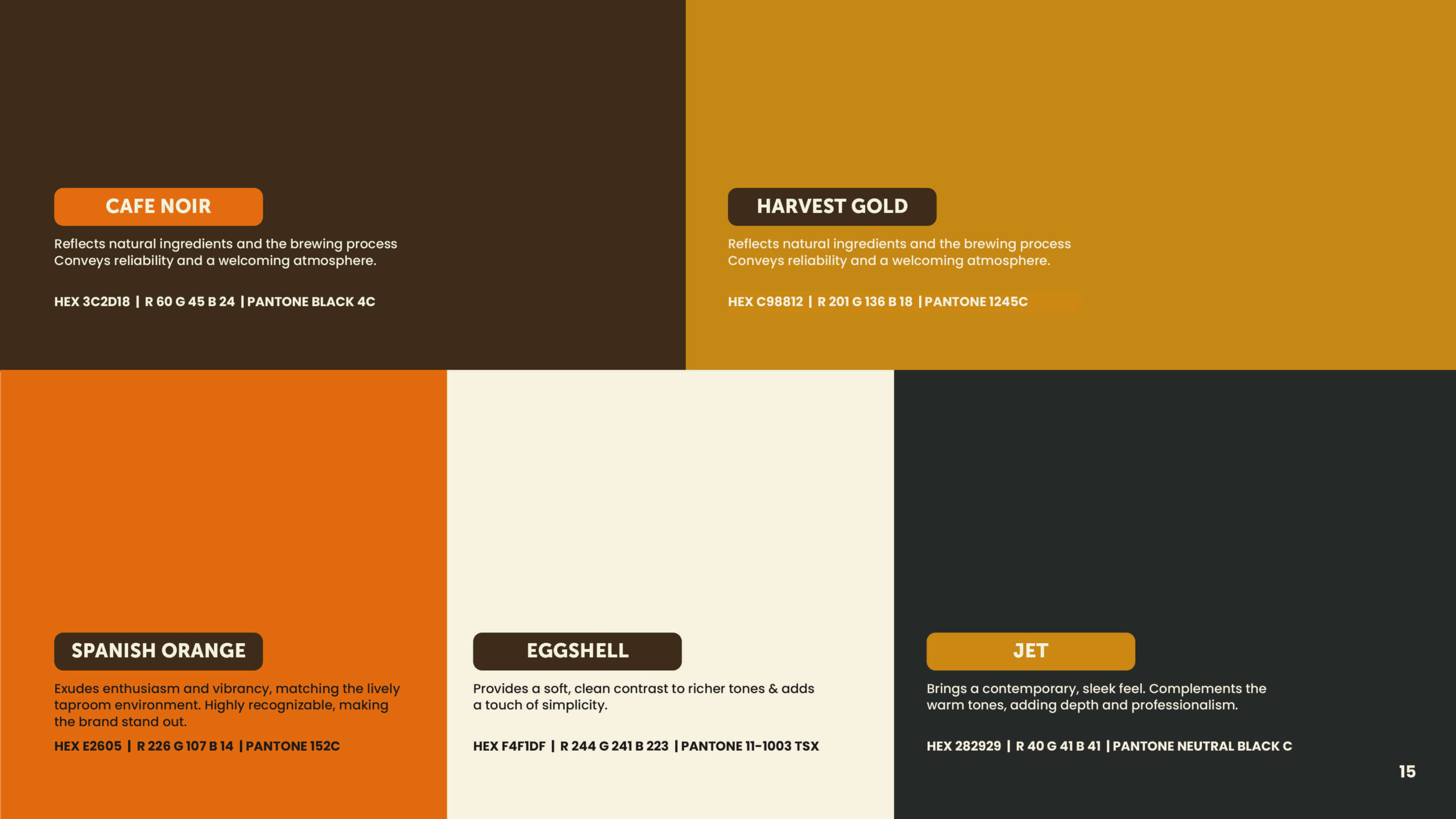
The color palette was inspired by Alberta’s rich landscapes and the brewery’s traditional roots. Shades like Café Noir and Harvest Gold bring warmth and depth, while Spanish Orange adds a lively touch, embodying the spirit of the taproom.
With these elements in place, the rebrand stayed true to the brewery’s heritage while giving it a fresh, cohesive look that stands out across every platform.
I believe everyone has a unique “Wonderland” inside them – a philosophy inspired by Alice in Wonderland – which I infuse into my work by embracing the weird and unexpected. No matter what I create, I’m always pushing the boundaries of design, exploring new possibilities with every project.