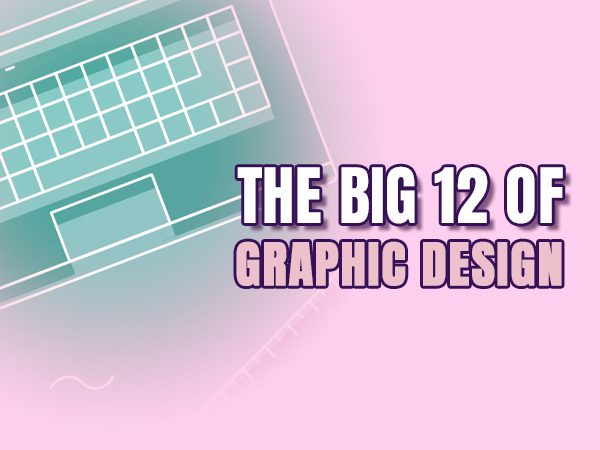
Whether you’re designing a brand, a website, or a flyer for your band’s next gig, great design isn’t just about making things look pretty – it’s about making things work. That’s where the 12 basic principles of design come in. These aren’t just rules for rule’s sake. They’re the secret sauce behind every clean layout, every striking poster, every logo that just feels right. In this blog, we’re breaking down each one – from contrast and balance to unity and movement – in real human language. No design jargon. No fluff. Just straight-up tips you can use whether you’re a beginner figuring things out or a seasoned pro who wants a refresher. Let’s turn chaos into composition, and guesswork into good design.
When you see good design, you just know – but knowing why it works? That’s where the real magic happens. Or rather, not magic: structure. Graphic design is creative, yes, but it’s also grounded in principles that guide your eye, shape your experience, and (ideally) stop you mid-scroll with a “whoa.”
These 12 rules aren’t trendy hacks or gatekept knowledge. They’re timeless fundamentals. Think of them as your design toolkit. Each one has a job: contrast grabs attention, hierarchy tells you what to read first, repetition builds consistency, white space gives the eye a break, and so on. When you use them intentionally, you’re not just making things that look good – you’re communicating clearly and confidently. And once you understand how they work together? That’s when you can start bending the rules to build something truly unique.
Whether you’re working on a full brand identity or whipping up a cute Instagram carousel, knowing these 12 principles will instantly make your work stronger, sharper, and more strategic.
Alright, let’s break down the Big 12. Each of these principles plays a role in creating visuals that are not just pretty – but purposeful. Here’s what they mean (and how to use them):
1. Contrast
Use contrast to highlight differences – light vs dark, thick vs thin, modern vs classic. It helps draw the eye and emphasize what matters most.
2. Balance
Balance is about arranging elements so your design feels stable. Symmetrical designs feel formal and classic, while asymmetrical layouts can feel more modern and dynamic.
3. Emphasis
Every design needs a focal point. Emphasis tells the viewer what to notice first – often using bold colour, size, or positioning to spotlight it.
4. Proportion
Proportion ensures that all elements are sized in relation to one another. It helps designs feel natural and intentional rather than random.
5. Hierarchy
Hierarchy organizes information visually so people know where to look first. Use font sizes, weight, and spacing to lead the eye through the content.
6. Repetition
Repetition reinforces branding and structure. Repeating elements like colors, shapes, or fonts builds consistency and strengthens recognition.
7. Rhythm
Rhythm creates a visual tempo using repeating elements, spacing, and flow. It can add motion and energy to otherwise static layouts.
8. Pattern
Patterns are repeated decorative elements that add texture and interest. They can help support branding or fill empty space with purpose.
9. White Space
Also called negative space, white space gives the eye room to breathe. It prevents clutter and focuses attention on what really matters.
10. Movement
Movement isn’t literal motion- it’s how the design guides the viewer’s eye. Lines, shapes, and positioning can suggest a visual journey.
11. Variety
Variety keeps things interesting by mixing different elements – like textures, shapes, or colors. Just be sure everything still feels connected.
12. Unity
Unity ties everything together. It’s the feeling that all design elements belong together, creating a polished and cohesive whole.
So, are these 12 principles of graphic design absolute laws written in stone? Nope. But they are powerful tools. When you understand them, you can use them to your advantage – either by applying them to build strong, clean designs or by breaking them strategically to make something bold and unexpected.
The best part? These rules don’t require a fancy design degree or expensive software. They just take practice, a little curiosity, and the willingness to look at things a bit differently. Once you start seeing these principles in action – in ads, book covers, websites, or even cereal boxes – you can’t unsee them. And that awareness is what transforms your eye from casual observer to confident creator.
So next time you start a project, think beyond “make it pretty.” Think: Does this have rhythm? Is there contrast? Am I guiding the eye? Because when you design with intention, the results speak for themselves.
Nope! You don’t need to tick all 12 boxes every time. Some designs may lean more on contrast and white space, while others use rhythm and pattern. The key is knowing which principles support your goal and using those intentionally. Think of them like ingredients—you don’t always need the whole spice rack.
Yes, yes, and yes. Templates are helpful, but they’re not foolproof. If you know these 12 rules, you can tweak a template to actually fit your message instead of just filling in the blanks. That’s how good design stands out.
Start by asking: Does something feel off? Is the message clear? If it’s hard to tell what’s important or your eye doesn’t know where to go, chances are one or more of these principles are out of balance. A little analysis goes a long way.
All the time! They’re second nature. Even the boldest, wildest creatives use these principles as a base. They may not follow them by the book, but they know when and how to bend them with purpose. The better you know the rules, the braver you can be.
Start by observing! Look at designs you like and ask yourself what principles are being used. Try recreating them to see how they’re built. And keep things playful—practice is where the fun (and the learning) happens.

I believe everyone has a unique “Wonderland” inside them – a philosophy inspired by Alice in Wonderland – which I infuse into my work by embracing the weird and unexpected. No matter what I create, I’m always pushing the boundaries of design, exploring new possibilities with every project.